🚀 UI Package Integration Guide
The injectConfigurator function injects the OV25 configurator UI into existing DOM elements on your page. It finds elements by CSS selectors and either replaces or appends the configurator components.
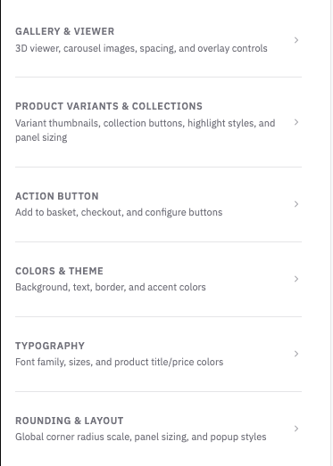
🛠️ OV25 Setup (Visual Config Builder)
Before you start hand-writing the config object, the fastest way to dial in the right combination of selectors, display modes, branding, and behaviour flags is the visual setup tool at app.orbital.vision/configurator-setup.
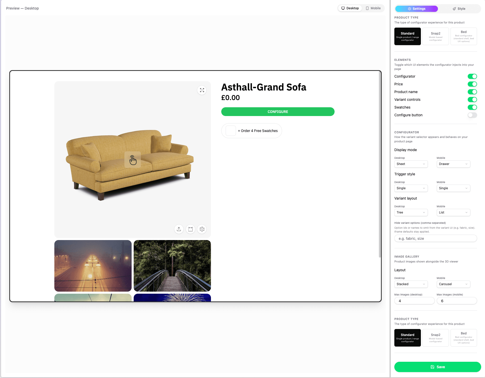
It's a UI wrapper around the same InjectConfiguratorInput JSON shape documented on this page - every toggle, dropdown, and text field on the left maps 1:1 to a property of the config object, and the preview on the right re-injects the configurator live so you can confirm the result before copying anything into your storefront.
What the setup tool covers:
- Product Type - Standard, Snap2 (modal), or Bed shells (controls
productLinkshape and the relevantbedblock) - Elements - which selectors to inject (
gallery,price,name,variants,swatches,configureButton) - Configurator -
displayMode,triggerStyle,variants.displayMode, andvariants.hideOptions - Image Gallery -
carousel.desktop/carousel.mobileandcarousel.maxImages - Branding -
branding.logoURL,branding.mobileLogoURL - Element styles - targeted CSS rules for known OV25 UI elements, emitted through
branding.cssString - Text overrides - customer-facing copy replacements, emitted through top-level
stringReplacements - Behaviour - every entry in
flags(hidePricing,disableAddToCart,hideAr,deferThreeD,showOptional,forceMobile,autoOpen)
Element Styles
The Style tab includes visual controls for many commonly styled elements of the configurator UI. These all end up in the generated config as branding.cssString.
You may want to further customise the configurator UI - The setup tool provides a searchable list of supported selectors, so you can easily target and apply styling to any part of the configurator UI.
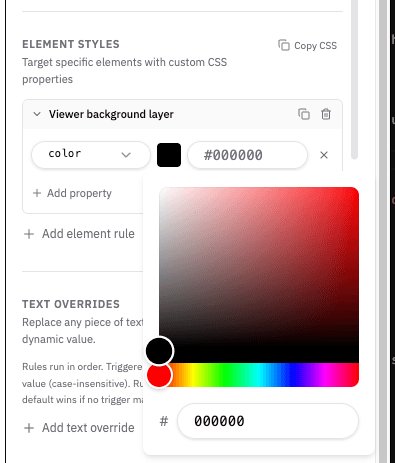
The setup tool currently supports common CSS properties such as background, background-color, color, border, border-color, border-width, border-radius, padding, margin, gap, font-size, font-family, font-weight, opacity, display, max-height, and min-height.
If you want to add more complex CSS rules, you can add them in the Custom CSS field.
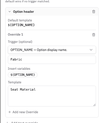
Text Overrides
The Text overrides section lets you customize customer-facing OV25 copy without changing component code. The generated config stores these values as top-level stringReplacements.
Overrides can be simple text replacements, or use conditions and dynamic values.
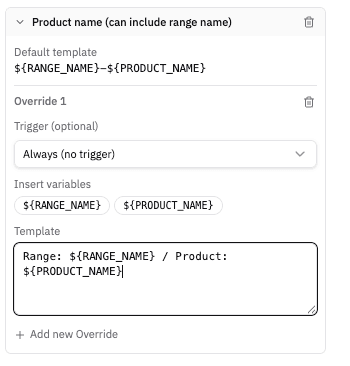
The below example shows how to rename the option "Fabric" to "Seat Material".
This example changes the product name from "Windrush Loveseat" to "Range: Windrush / Product: Loveseat".
Use text overrides for storefront wording such as button labels, option headings, product titles. The setup tool uses the same string catalog exposed by STRING_REPLACEMENT_DEFINITIONS, so each override is tied to a supported OV25 text key.
Basic text overrides use a single default rule:
Conditional text overrides can use triggers. Trigger values are matched case-insensitively, and the first matching rule wins:
Templates can include supported interpolation variables such as ${OPTION_NAME}, ${PRODUCT_NAME}, or ${PRICE}, depending on the selected text key. See the String Replacements section below for the full runtime config shape and matching behaviour.
Saving
When you hit Save, the tool emits the same JSON you'd otherwise pass to injectConfigurator(...):
Drop that JSON straight into injectConfigurator(...) and add your callbacks (the setup tool can't generate addToBasket / buyNow / buySwatches for you - those are storefront-specific functions).
⚠️ Heads up: the setup tool can be a bit buggy in places (live preview occasionally needs a refresh, some combinations don't re-render until you toggle them again). Despite that, it's still the fastest way to find the combination of settings that look and behave correctly on your product page - once you're happy, copy the JSON out and treat this page as the source of truth for any field-level details.
📦 Installation
Install the package using npm:
💡 Note: Always use
@latestto ensure you have the most recent version with all the latest features and bug fixes.
📦 Usage
✅ Required Fields
| Field | Type | Description |
|---|---|---|
apiKey | StringOrFunction | OV25 API key |
productLink | StringOrFunction | Product ID or path (e.g. '217', 'snap2/4' for multi-product modular, 'range/126') |
selectors | SelectorsConfig | DOM targets for gallery, price, name, variants, swatches, configureButton |
callbacks | CallbacksConfig | addToBasket, buyNow, buySwatches (required); onChange (optional) |
Full Config Type
Minimal Example
🎯 Selectors
Each selector can be a string (CSS selector) or an object:
| Selector | Purpose | Required | Notes |
|---|---|---|---|
gallery | Main 3D/image container | Standard products | For multi-product modular configs, gallery chrome may live inside the configurator modal |
price | Price display | When not hiding pricing | Omit when flags.hidePricing: true |
name | Product name | Recommended | |
variants | Variant controls | Products with variants | Omit for products without variants |
swatches | Swatch selector | Products with swatches | Omit when no swatches |
configureButton | Button that opens configurator | Multi-product modular | Required for multi-product modular flows; optional for standard single-product |
Replace vs Append
replace: true– Replaces the target element's content with the configurator UIreplace: falseor omitted – Appends the UI inside the target element
Examples from Tests
Standard product with full selectors:
Multi-product (modular) with configure button:
Configure button only:
No variants – omit variants:
No pricing – omit price, set flags.hidePricing: true:
🎠 Carousel
Controls thumbnail display below the main image.
| Value | Description |
|---|---|
'none' | No carousel thumbnails |
'stacked' | Thumbnails stacked vertically |
'carousel' | Thumbnails in horizontal carousel |
Defaults: desktop: 'stacked', mobile inherits from desktop.
Examples
No carousel:
Stacked with max images:
Horizontal carousel:
Standard:
Note: Multi-product modular products (
productLink: 'snap2/…') don't use the image carousel - carousel settings are ignored and treated as'none'.
🎛️ Configurator
Controls how the configurator panel is shown and how variants are displayed.
Display Mode
| Desktop | Mobile | Description |
|---|---|---|
'inline' | 'inline' | Variants shown inline on the page |
'sheet' | 'drawer' | Full-screen sheet (desktop), bottom drawer (mobile) |
'sheet' | 'inline' | Sheet on desktop, inline on mobile |
'modal' | 'modal' | Centered modal on desktop and mobile (uses a deferred gallery container when no gallery selector is provided) |
'inline-sheet' | 'drawer' | Multi-product modular only: inline gallery stage with the variant sheet docked over one edge (desktop) |
Defaults: desktop: 'sheet', mobile: 'drawer' (when desktop is sheet or inline-sheet) or 'inline' (when desktop is inline) or 'modal' (when desktop is modal).
Trigger Style
'single-button'– One "Configure" button'split-buttons'– Separate Add to basket / Buy now Default:'single-button'
Variant Display Mode
| Value | Description |
|---|---|
'tree' | Hierarchical tree |
'list' | Flat list |
'tabs' | Tabbed groups |
'accordion' | Collapsible sections (desktop only; mobile falls back to tree) |
'wizard' | Step-by-step wizard |
Defaults: desktop: 'tree', mobile: 'tree'
useSimpleVariantsSelector
When true, shows a single "Configure" button that opens the variant panel. Useful when you don't want inline variant controls.
Default: true (a single Configure button is rendered when no inline variant UI is requested).
hideOptions
Array of option ids or display names (case-insensitive) to omit from the variant UI (list, wizard, tabs, tree, accordion). Iframe defaults and CURRENT_SKU state still apply for hidden options - users simply cannot change them in the shell.
Examples
Inline + wizard:
Sheet + tabs:
Inline + accordion:
Configure button only with simple selector:
✏️ String Replacements
Use stringReplacements to customize text shown by the OV25 configurator without changing the component code. This is useful for client-specific wording, regional terminology, or changing labels based on the option/product currently being displayed.
STRING_REPLACEMENT_DEFINITIONS exposes the supported text keys, their default text, and the interpolation variables each key accepts. Use it when building setup/admin UIs so users only configure valid keys and variables.
Config Shape
Each key maps to an ordered list of rules.
- Rules with a
triggerare checked first, in array order. - Trigger matching is trimmed and case-insensitive.
- The first matching triggered rule wins.
- If no triggered rule matches, the first rule without a trigger is used as the default.
- If no rule resolves, OV25 shows the built-in fallback text.
- Missing interpolation variables are replaced with an empty string.
Basic Example
Conditional Rules
Use trigger when text should change only for a specific runtime value.
In this example, an option called Leg, leg, or leg will display as Leg Type. Other options fall back to their original option name.
Discovering Available Keys
Use STRING_REPLACEMENT_DEFINITIONS to list available keys and variables:
Each definition has this shape:
Notes
stringReplacementsis additive. If omitted, OV25 uses its normal built-in text.- Keep templates customer-facing. Internal ids, CSS selectors, and enum values should not be translated or replaced.
- For Shopify and WooCommerce integrations, make sure saved config/metafields pass
stringReplacementsthrough toinjectConfigurator.
📞 Callbacks
- addToBasket – Add configured product or scene to basket. When invoked by the UI, receives a normalized
OnChangePayload;skusandpricemay benulluntil those iframe messages have arrived. - buyNow – Checkout immediately. Same payload shape as addToBasket.
- buySwatches – Purchase selected swatches. Receives
Swatch[]andSwatchRulesData. - onChange – Optional. Fires when price or SKU updates. Payload is normalized by the UI package (see below);
skusandpriceare eachnulluntil that message type has been received at least once.
📋 Payload Types (skus and price)
The iframe emits CURRENT_SKU and CURRENT_PRICE as postMessage events. Wire JSON can differ between single-product and multi-product configurators (one billable line vs many). The UI package normalizes both into one contract before your callbacks run.
OnChangePayload is an alias of UnifiedOnChangePayload:
| Key | Type | When populated |
|---|---|---|
skus | UnifiedSkuPayload | null | After first CURRENT_SKU |
price | UnifiedPricePayload | null | After first CURRENT_PRICE |
Canonical fields for new integrations: use payload.skus.lines and payload.price.lines, and branch on payload.skus.mode / payload.price.mode ('single' \| 'multi').
Legacy (single-product only): when skus.mode === 'single', top-level skuString and skuMap match older integrations. For multi-product SKU payloads, mode === 'multi' and there is no top-level skuString-iterate lines instead.
Null-check and narrow mode before reading skuString:
Optional helpers (same package) if you handle raw postMessage outside injectConfigurator: normalizeSkuPayload, normalizePricePayload, parseIframeJsonPayload.
UnifiedSkuPayload (skus)
Discriminated union:
mode | Meaning | Top-level skuString / skuMap | Canonical |
|---|---|---|---|
'single' | One configured product | Set (backward compatible) | lines[0] plus legacy fields |
'multi' | Multiple billable lines in the scene | Absent | lines only |
OnChangeSkuPayload in TypeScript is an alias of UnifiedSkuPayload.
UnifiedPricePayload (price)
Order-level totals plus normalized per-line breakdown (replaces relying only on raw priceBreakdown / productBreakdowns from the iframe):
| Field | Description |
|---|---|
totalPrice, subtotal | Minor units (e.g. pence). |
formattedPrice, formattedSubtotal | Display strings. |
lines | Canonical per-line pricing; use for multi-product carts. |
priceBreakdown / productBreakdowns | Optional passthrough of raw iframe arrays for legacy tooling. |
OnChangePricePayload is an alias of UnifiedPricePayload.
Swatch and SwatchRulesData (buySwatches)
Example with onChange
⚙️ Optional Fields
configurationUuid
Saved configuration UUID for multi-product modular experiences. Restores a previously saved scene/configuration.
images
Override product images (e.g. for galleries with custom image sets).
uniqueId
Disambiguates when multiple configurators share global containers (e.g. mobile drawer, toaster).
branding
cssString – Custom CSS injected into configurator components. See Configurator Styling for CSS variables, class names, and data attributes.
hideLogo – Hide the OV25 / brand logo in the configurator chrome.
flags
| Flag | Type | Description |
|---|---|---|
hidePricing | boolean | Hide price display |
disableAddToCart | boolean | Disable the add-to-cart / checkout buttons (UI rendered but not actionable) |
hideAr | boolean | Hide AR features |
deferThreeD | boolean | Defer 3D loading until the configurator is opened |
showOptional | boolean | Show optional options |
forceMobile | boolean | Force mobile layout (e.g. for device frame testing) |
autoOpen | boolean | Auto-open configurator on load (non-inline only). Default false. |
currencySymbol | string | Display symbol replacing £ in iframe-formatted prices after normalization. Not FX conversion. Default £. |
bed
Bed-specific configuration. Only relevant for bed iframe products.
dining
Dining-specific configuration. Only relevant for dining configurator products (productLink: 'dining-configurator/<id>'); injectConfigurator delegates these links to the dining embed automatically (an injectDiningConfigurator export is also available).
🏷️ Product Types (productLink)
| Pattern | Example |
|---|---|
| Single product | '217', '58', '607' |
Multi-product modular (snap2/… path) | 'snap2/4', 'snap2/126' |
| Range | 'range/126', 'range/85' |
| Bed configurator | 'bed-configurator/2' |
| Dining configurator | 'dining-configurator/3' |
The snap2/ prefix is the URL convention for multi-product modular configurators; callback payloads still use mode: 'single' | 'multi', not this path string.
🔄 Multiple Configurators
Pass an array of configs. Each config must use distinct selectors (e.g. #gallery-1, #gallery-2). For standard configs, gallery and variants selectors must be unique across configs.
⚠️ Multi-product modular with
replace: trueon configure buttons: When multiple such configs usereplace: true, only one configurator instance is active at a time. Clicking a different configure button switches to that product's configurator.
Multi-product modular, configure buttons only:
4 products with gallery, price, name:
Inline variant controls per product – use configurator.displayMode: { desktop: 'inline', mobile: 'inline' }.
Ranges with variants – use productLink: 'range/126' with variants selector.
🌐 Global APIs
When the configurator is injected, these functions are exposed on window:
| Function | Description |
|---|---|
window.ov25OpenConfigurator(optionName?) | Open configurator; optionally focus an option group (e.g. 'wood finishes') |
window.ov25CloseConfigurator() | Close configurator |
window.ov25OpenSwatchBook() | Open swatch book |
window.ov25CloseSwatchBook() | Close swatch book |
window.ov25GenerateThumbnail() | Capture the current 3D scene as an image. Returns Promise<string> resolving to a CDN URL of the screenshot. Rejects on timeout (10s) or iframe error. |
Example:
🕰️ Legacy Format
A flat config format is supported for backward compatibility. Use addToBasketFunction, buyNowFunction, buySwatchesFunction (or addSwatchesToCartFunction as alias), onChangeFunction, and flat selector/carousel/configurator fields instead of callbacks, selectors, carousel, configurator. The grouped format above is preferred.
Most flag/branding fields are also available at the top level of the legacy config (no flags / branding wrapper):
hidePricing,disableAddToCart,hideAr,deferThreeD,showOptional,forceMobile,autoOpen,currencySymbollogoURL,mobileLogoURL,cssString,hideLogohideOptions(variant hide list)bedAllowNone,bedFilterSelectionsByCurrentSize(bed iframe equivalents ofbed.allowNone/bed.filterSelectionsByCurrentSize)- Selector aliases:
galleryId,priceId,nameId,variantsId,swatchesId,configureButtonId(deprecated; use*Selectorinstead) variantDisplayStyle/variantDisplayStyleMobile(deprecated aliases forvariantDisplayMode/variantDisplayModeMobile)useInlineVariantControls(deprecated; equivalent toconfigurator.displayMode.desktop = 'inline')
Built with ❤️ by the Orbital Vision team